An Overview
#ETL #Python #Crawler #Selenium #BeautifulSoup #Pandas #Plotly #Numpy #PowerBI
An Overview
#ETL #Python #Crawler #Selenium #BeautifulSoup #Pandas #Plotly #Numpy #PowerBI
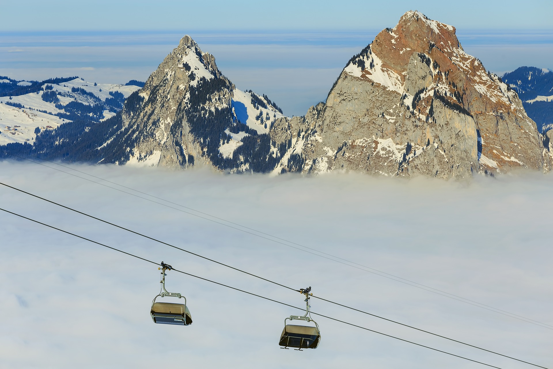
I am really into skiing and this season 2022/23 snowfall was very rare. Most of the time the skiresorts looked like the picture below. It was miserable. I planned to go skiing over the Christmas break, however, it turned out that there was too little snow. There was no snow and I had a lot of free time, so I looked into the data of our ski resorts in Switzerland. I had no specific goal in mind. I started gathering data with Python scrapers, transformed the data and displayed the data with different tools such as Power BI from Microsoft, Pandas as a Python library and Plotly as another Python library. The goal in the end turned out to have fun in working with interesting data and applying techniques to the data.
I found three webpages with interesting data and started to collect the data.
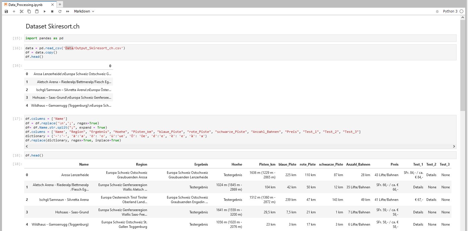
The webpage displays 356 ski resorts in Switzerland. It shows a ranking, the lowest altitude, the highest altitude, the total length of the slopes (divided in black, red, blue), the number of ski lifts and the price of a ski pass in Swiss Francs and Euro. I crawled the data with this crawler on Github. The crawler is build with selenium and the data manipulation is done with pandas. The output of the crawler is then stored the folder Data.
MySwitzerland also provides information about Swiss ski resorts, however, the number of the resorts is smaller. I crawled the data from MySwitzerland too and used the same tools. The code can be found here on Github
Since I was not very happy with the result from Skiresorts.ch and MySwitzerland, especially in terms of displaying the current conditions, for example snowfall overnight. I crawled a page from Bergfex.ch too. The code can be found here on Github
After gathering the data. I transformed the data on a Jupyter Notebook with Pandas Github. I did the cleanup with the MySwiterland and the Skiresort.ch data.
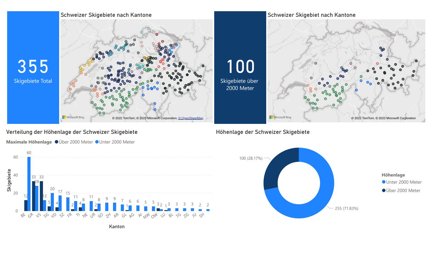
After a few manual changes in the excel-file, I had an overview of the 356 ski resorts from the skiresort.ch website. I immediately put the data into a Power Bi report, however, when I tried to map the data with Power BI and Power Bi displayed dots from all over the world. So I knew, I had to enrich the data, to get unique values for the location. To get a map of the datapoint without the exact location I used the cantons as a geolocation and created a first draft in PowerBI.
I enriched the data with Post Codes from a dataset from the Swiss Post, mapped the data again and I had still wrong datapoints on the map. So I looked for geodata: Altitude and longitude. Again I found a dataset from the Swiss Post and enriched my data with longitude and latitude. The Juypter notebook with the Python code (mainly pandas) can be found here.
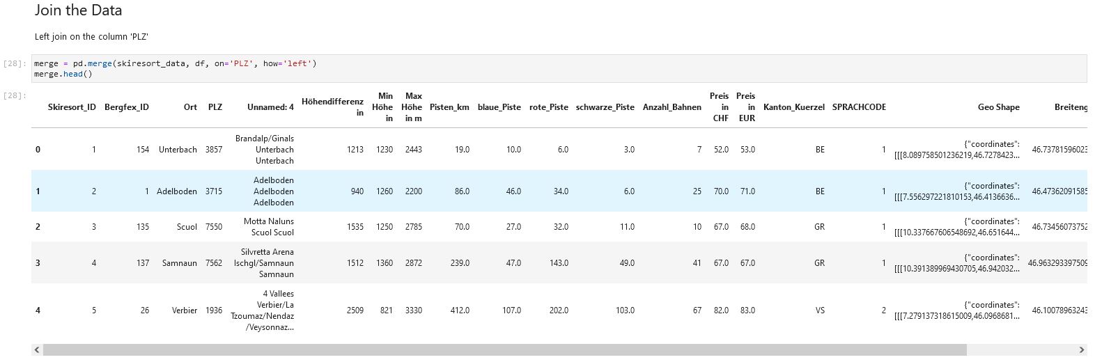
With the enriched Data I could create a more detailed Power BI Report. The report shows the altitude of the 355 skiresorts I have crawled.My take-away from the creation of the map in Power BI is that it is very easy to create a map, however, the customization possibilities are limited.
As a next step, I will continue with the data visualisation in Python and its libraries.
As I love working with Python and its handy and effective functions, I visualised the data with it. The code can be found here.
I wanted to gain insights about the ticket pricing of the Swiss ski resorts. Moreover, I wanted to check, if there are any correlations with other parameters. To start off I had to drop all ski resorts which I did not have any pricing data, so I ended up with dropping 61 ski resorts.
To kick of I created a correlation matrix and displayed it with the library seaborn. On the matrix one can see, tha the altitude difference has the highest correlation with the variable price. The number of ski lifts or the total kilometer of slopes has a lower correlation. In the following analysis I set the focus on the variable "altitude difference".
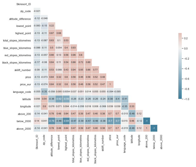
I wanted to plot the variables on a scatter plot. And put a regression line in the plot. The regression line is a linear model with the method ordinary least squares. The r-squared value above 0.7 indicates a high level of correlation. A high number of difference in altitude can lead to a high ski-ticket price. Hovering over the red regression line additional information is displayed.
I was wondering where can I get the most of my ticket price in terms of total slope km. So I create the ratio total_slope_km divided by ticket_price. Again I plotted it on a scatter plot. The size and the colors of the points on the graph displays the ratio. The analysis shows, that the skiresort Les Portes du Soleil has the best kilometer to ski ticket price ratio. Hovering over the datapoints additional information is displayed.
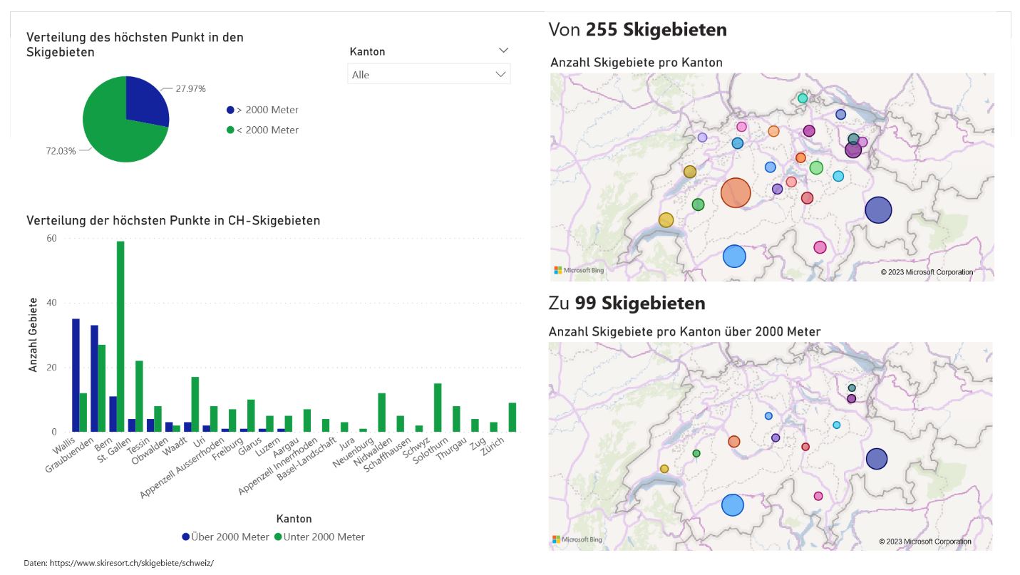
After the price analysis I wanted to look into the altitude levels. Firstly I created a new dataframe, by grouping the data with pandas groupby-function. Then I plotted the data to create a grouped bar chart. Most of the ski resorts are located in the canton of Bern, however, most ski resorts in the canton, have their highest point below 2000 meters. The most ski resorts above 2000 meters are located in the canton of Wallis and Graubünden. In 13 of 24 cantons, ski resorts are located below 2000 meters.
After the creation of the bar chart I plotted this pie chart. The pie chart that nearly three quarters of all Swiss ski resorts have their highest point below 2000 meters.
Click on the map legend to adjust the data points. Hovering over the datapoints the number of ski resorts per canton is displayed.
Firstly, I created a map with the px.scatter_geo function. This is a function for a Geo Maps, which is used to create outline-based maps. I used the latitude and the longitude as I did it with the second PowerBI Map. I set the geo_scope to "Europe" and let the map focus on the point on the map. However, I was not satisfied with the result, since the map provides too little details.
Click on the map legend to adjust the data points. Hovering over the datapoints the corresponding ski resort is displayed.
Secondly, I created a map with the px.scatter_mapbox function. The Mapbox maps are tile-based maps. I used the same approach with the longitude and latitude as the locations on the map. The mapbox_style is set to"Carto-positron". I used the style since it fitted the most and I did not have to get a Mapbox Access token.
Click on the map legend to adjust the data points. Hovering over the datapoints the corresponding ski resort is displayed.
I am currently working on integrating more data into the maps. Stay tuned.